This week’s task asked me to observe something specific, collect data about it, and analyse what I found.
For this task, I wanted to pay closer attention to something I usually ignore, the colours of cars I encounter throughout the day. My goal was to observe the colour distribution of cars to understand how people’s colour preferences shape built environments.
I chose to focus on the car colour distribution in my neighbourhood. I wanted to discover:
Which colours are most common
Whether bright colours appear often or regularly
Whether the data matched my assumptions about car colour trends
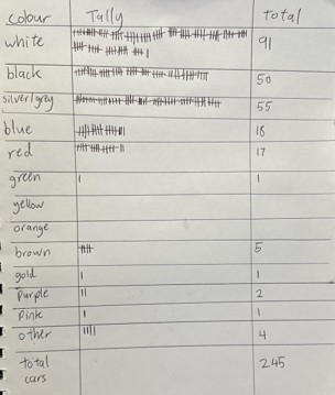
To collect the data, I used a notebook and tallied each car colour as I encountered it. To avoid miscounting, I only counted parked cars as if I counted a moving car, I might accidentally recount it later when it parks.
Interesting Findings
Across the day, I documented a total of 245 cars.
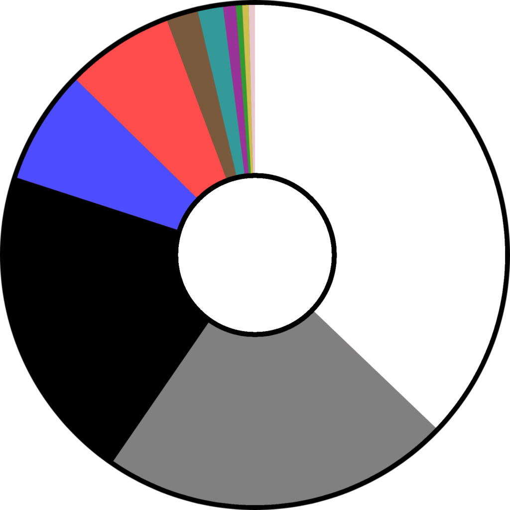
As can be seen in the chart below, the data shows that monochromatic cars are by far the most dominant. Furthermore, coloured cars were mostly red or blue.
The overwhelming abundance of neutral-coloured cars suggests that there is a strong cultural preference for perhaps “safe” colours.

Surprising Findings
Yellow and orange cars did not appear once in my neighbourhood.
However, pink and gold, which I did not expect to find any of, together appeared more than green. Additionally, the lack of green cars in general were a surprise to me.
Comparing Data to Other Studies
| Colour | Total | Percentage |
| White | 91 | 37.1% |
| Silver/Grey | 55 | 22.4% |
| Black | 50 | 20.4% |
| Blue | 18 | 7.3% |
| Red | 17 | 6.9% |
| Brown | 5 | 2.0% |
| Other | 4 | 1.6% |
| Purple | 2 | 0.8% |
| Green | 1 | 0.4% |
| Gold | 1 | 0.4% |
| Pink | 1 | 0.4% |
| Yellow | 0 | 0% |
| Orange | 0 | 0% |
| Total Cars | 245 |
| Colour | Percentage |
| White | 27.6% |
| Black | 22.0% |
| Grey | 21.3% |
| Silver | 9.1% |
| Blue | 8.9% |
| Red | 7.3% |
| Green | 2.0% |
| Orange | 0.5% |
| Beige | 0.5% |
| Brown | 0.4% |
| Yellow | 0.2% |
| Gold | 0.1% |
| Purple | 0.1% |
Though the sample size for this data was quite small, it mostly aligned with the data found in similar studies. As can be seen in the tables not only are the percentages similar, but the order of cars by popularity are also nearly identical. The data only diverges when measuring the popularity of the unpopular colours. This can be attributed to the small sample size in my data.
Reflection
This task made me realise how much design goes unnoticed. Car colours are a product of industrial design, marketing, cultural preference, and practicality. By simply counting cars for a day, I became more aware of how uniform everyday objects can be, and how rare individuality appears in mass‑produced environments. The exercise strengthened my observational skills and reminded me that even mundane data can reveal interesting patterns when examined closely.
References
Germain Cars n.d., Most popular car colors | study by iSeeCars | Germain Auto Group, Germain Cars, viewed 10 August 2026, <https://www.germaincars.com/most-popular-car-colors/>.